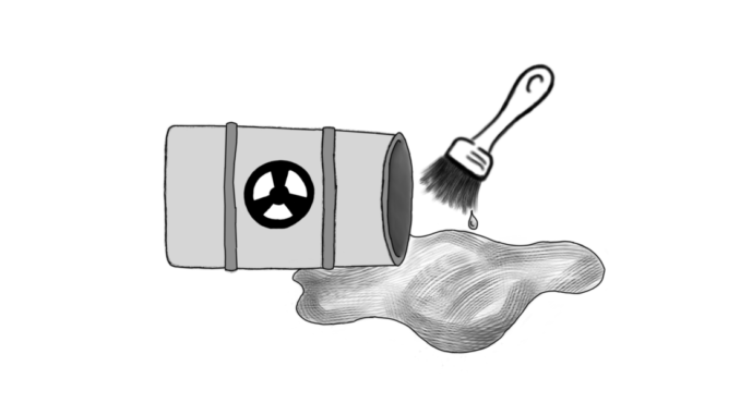
Flashback to last week, when, attempting to access the course catalogue, I turned my attention to the trusty Lewis & Clark website. Lethargically I stabbed at the “l” … “c” … “l” on my keyboard, and then stared, shocked, at my screen. The LC website, usually such a calming dark green, reminiscent of the Pacific Northwest forest that I love so much, now was a bright splash of orange across my screen. This orange was not the glow of a sunset, the freshness of the fruit, the crisp brightness of leaves right before falling; no, this orange was the color I imagine of a radioactive spill. Before seeing this website, I never would have described orange as “vomit colored,” but the color seared across my eyeballs inexorably reminds me of the puke produced by hours of chugging jungle juice.
Though the color is unsettlingly bright and the header lacks a transition to the rest of the page, I understand the motivation behind it. Perhaps we should have a website that reflects our school colors. But this attempt seems half-hearted and rushed — scroll to the bottom of the front page and you will notice that the green remains along with the skyline of Portland. The element containing quotes from current students and alumni over the front page photo retains the tinted dark green of the old website. The website was clearly not rebuilt completely or even thoughtfully redesigned — the orange banner was merely slapped over the existing green pages, leaving two colors that are entirely uncomplimentary to wage war with one another. Dig further, and you will find that the banner is not even applied to all of the pages.
The graduate and law schools understandably seem to have opted out of this color change, but older pages have also not been changed, such as the pages where the course catalogs reside. Furthermore, when one first navigates to the page the orange loads before the paint brush texture appears, leaving a strange transition that leaves one wishing for the plain orange instead.
I can imagine a visually pleasing orange website. A removal of the streaky yellowish-orange paint brush effect would be an improvement, as would some kind of transition from the banner to the rest of the page such as a transparent bar (an element that was actually removed from the old website). The presence of dark grey or black elements might add some depth to the brightness of the website. Most importantly, the removal of all dark green elements would vastly improve the overall coherency of the page. As it exists, the new website is a half-assed eyesore — but hey, at least it matches our promotional material.
Subscribe to the Mossy Log Newsletter
Stay up to date with the goings-on at Lewis & Clark! Get the top stories or your favorite section delivered to your inbox whenever we release a new issue.

Leave a Reply